Responsiveness web design- what needs to be known about css responsiveness


The Internet took off quicker than anyone would have predicted, growing like crazy. Now, for the past few years, mobile growth has exploded onto the scene. The growth of mobile Internet usage is also far out pacing that of general Internet usage growth. These days it is hard to find someone who doesn’t own a mobile device, or multiple, connected to the Internet. In the UK there are more mobile phones than people, and should trends continue mobile Internet usage will surpass that of desktop Internet usage within the year. With the growth in mobile Internet usage comes the question of how to build websites suitable for all users. The industry response to this question has become responsive web design, also known as RWD.
Responsive web design provides an optimal experience, easy reading and easy navigation with a minimum of resizing on different devices such as desktops, mobiles and tabs). Responsive structure Below image shows the responsive structure of web pages.

Responsive Overview Responsive web design is the practice of building a website suitable to work on every device and every screen size, no matter how large or small, mobile or desktop. Responsive web design is focused around providing an intuitive and gratifying experience for everyone. Desktop computer and cell phone users alike all benefit from responsive websites. The responsive web design term itself was coined, and largely developed, by Ethan Marcotte. A lot of what is covered in this lesson was first talked about by Ethan online and in his book Responsive Web Design, which is worth a read.
Flexible Layouts Responsive web design is broken down into three main components, including flexible layouts, media queries, and flexible media. The first part, flexible layouts, is the practice of building the layout of a website with a flexible grid, capable of dynamically resizing to any width. Flexible grids are built using relative length units, most commonly percentages or em units. These relative lengths are then used to declare common grid property values such as width, margin, or padding.
Relative Viewport Lengths
CSS3 introduced some new relative length units, specifically related to the viewport size of the browser or device. These new units include vw, vh, vmin, and vmax. Overall support for these new units isn’t great, but it is growing. In time they look to play a large roll in building responsive websites.
vw Viewports width
vh Viewports height
vmin Minimum of the viewport’s height and width
vmax
Maximum of the viewport’s height and width Flexible layouts do not advocate the use of fixed measurement units, such as pixels or inches. Reason being, the viewport height and width continually change from device to device. Website layouts need to adapt to this change and fixed values have too many constraints. Fortunately, Ethan pointed out an easy formula to help identify the proportions of a flexible layout using relative values. The formula is based around taking the target width of an element and dividing it by the width of it’s parent element. The result is the relative width of the target element.

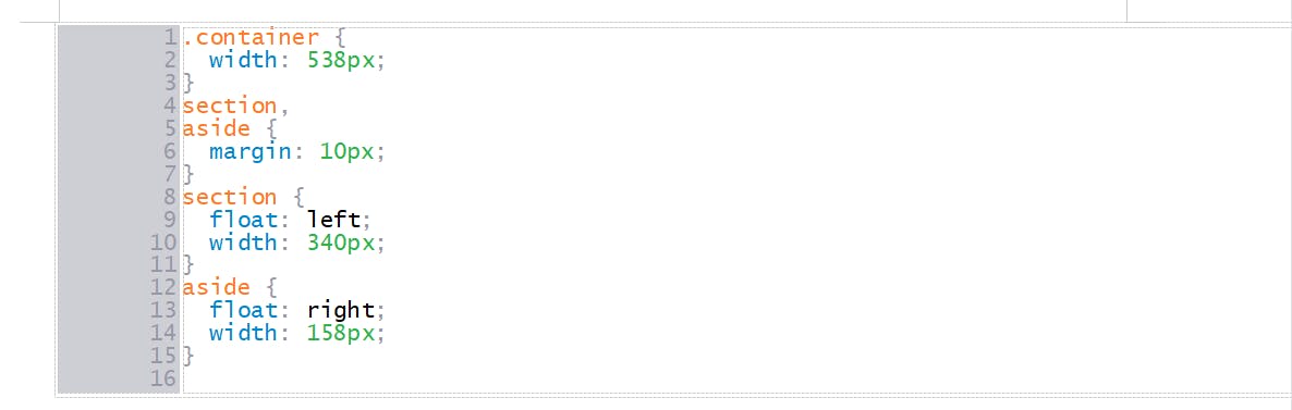
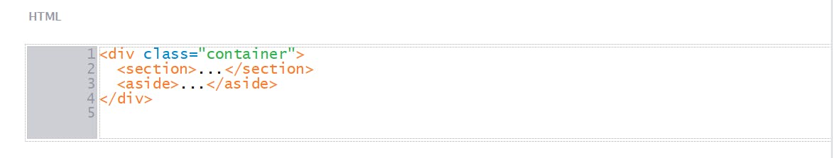
Flexible Grid Let’s see how this formula works inside of a two column layout. Below we have a parent division with the class of container wrapping both the section and aside elements. The goal is to have the section on the left and the aside on the right, with equal margins between the two. Normally the markup and styles for this layout would look a bit like the following.
HTML
CSS